Art Design: Portrait Painting Techniques & Color Tips
Ever wonder why some portraits seem to breathe while others feel stiff? The secret lies in the blend of solid technique and smart color use. In the Art Design section we break down exactly what you need to make your portraits pop, without drowning in jargon.
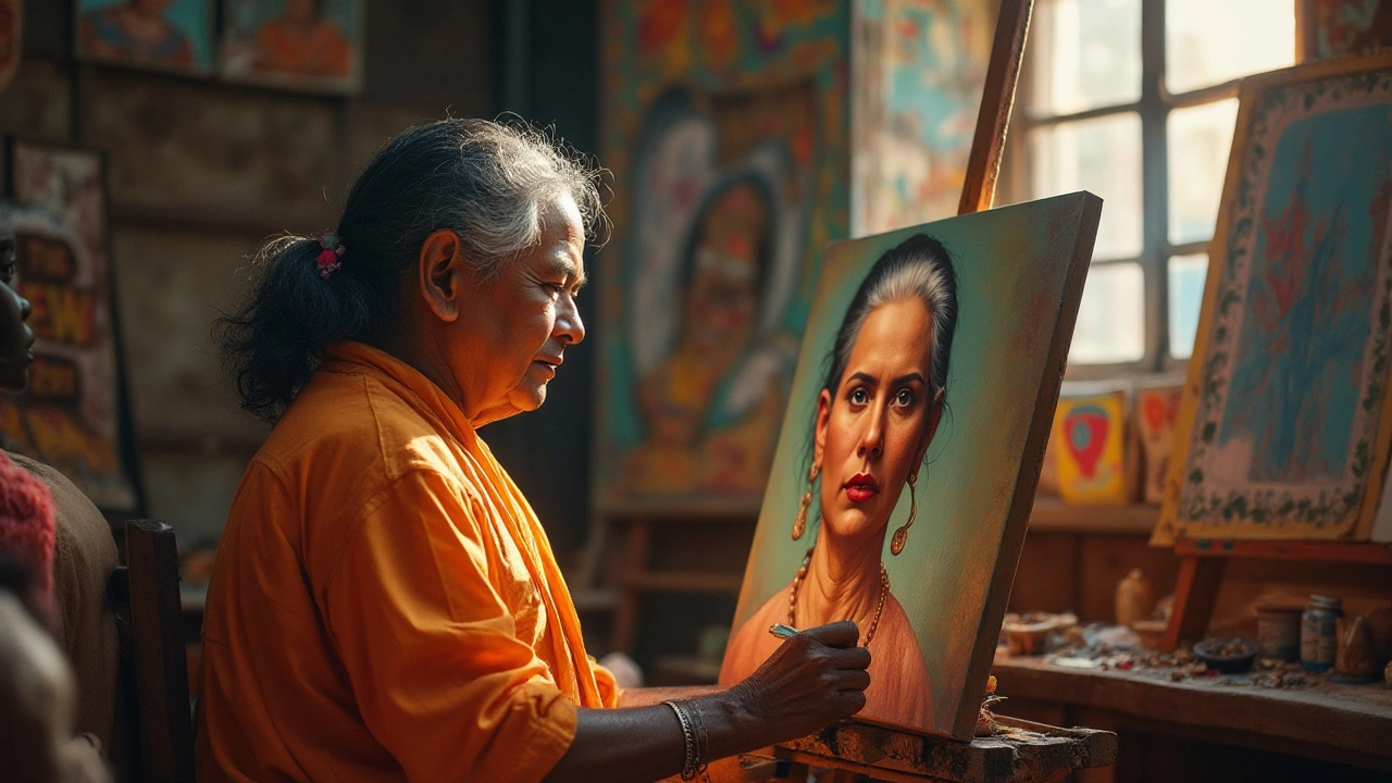
Mastering Portrait Painting Techniques
First off, think of the face as a map of light and shape. Start with a light sketch to place the eyes, nose, and mouth – these landmarks guide your shading later. Many artists swear by the “blocking in” method: lay down broad shapes of light and shadow before adding details. It keeps the composition balanced and saves time.
When you move to layering, use thin glazes rather than thick blobs of paint. A glaze lets underlying tones show through, creating depth that mimics real skin. Mix a bit of burnt umber or raw sienna into your base to give the flesh a warm undertone. Then, as you build layers, watch how each adds a subtle shift in mood.
Texture matters, too. A dry brush can suggest fine hair or the softness of a cheek, while a wet brush blends edges for smoother transitions. Practice these two opposite strokes on a spare canvas – you’ll spot the difference instantly. Remember, the goal isn’t perfection, but a convincing sense of presence.
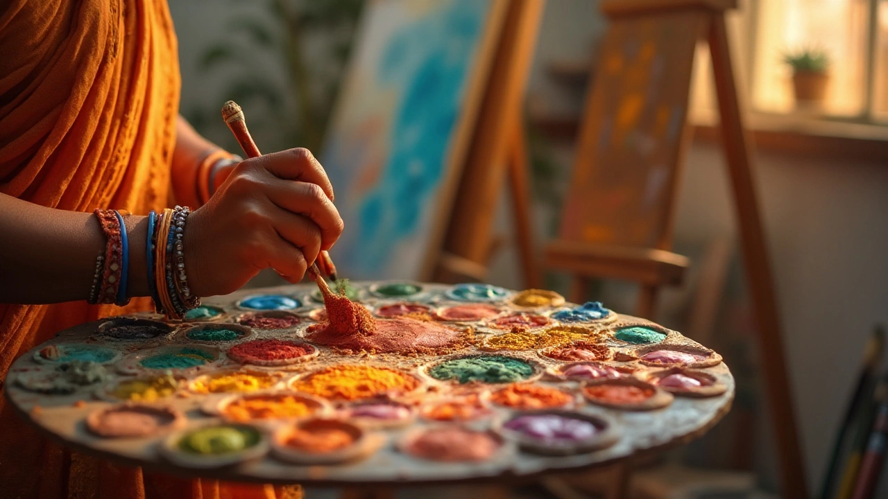
Choosing the Right Colors for Portraits
Color isn’t just decoration; it tells the story of the subject’s personality and setting. Start with a basic color wheel: complementary colors sit opposite each other and help you create contrast. Pair a warm skin tone with a cool background to make the face stand out.
Skin tones are more than just “flesh pink.” Look at real photos and notice the tiny hints of green, blue, or violet in shadows. Mixing a touch of ultramarine or a dash of yellow ochre into your dark shadows can add realism. For highlights, a tiny splash of cadmium yellow or even a hint of white will catch the light just right.
If you’re unsure about a palette, try a quick swatch test. Paint a small square with your underpainting, then layer your chosen colors on top. Step back, and you’ll see if the hues clash or blend harmoniously. Adjust as needed before committing to the full portrait.
Finally, trust your gut. Color is personal, and what feels right on one canvas might feel off on another. Experiment, note what works, and soon you’ll develop a signature palette that makes every portrait unmistakably yours.
Ready to take your portrait game up a notch? Apply these techniques, play with the color tips, and watch how quickly your art design evolves. Keep exploring, keep painting, and let each brushstroke bring your subjects to life.