Best Colors: Top Shades Every Artist Should Know
Choosing the right color can turn a good piece into a great one. Whether you work with oil, watercolor, digital tools, or sculpture, the colors you pick affect mood, depth, and viewer reaction. In this guide we’ll break down the most popular shades in 2024‑2025, show you how to match them to different mediums, and give you easy ways to build a winning palette.
Why Certain Colors Are Hot Right Now
Color trends aren’t random. They follow cultural shifts, tech breakthroughs, and even the weather. This year designers love muted earth tones mixed with bright neon accents. Think rust orange, soft sage, and electric teal. The combo works because the calm base lets the bright pop stand out without screaming.
Digital artists are also drawn to AI‑generated palettes that mimic nature. A gradient from sunrise pink to deep indigo appears a lot in album covers and book promos. If you’re stuck, try pulling a screenshot from a recent music video or a popular Instagram post – you’ll see the same shades popping up.
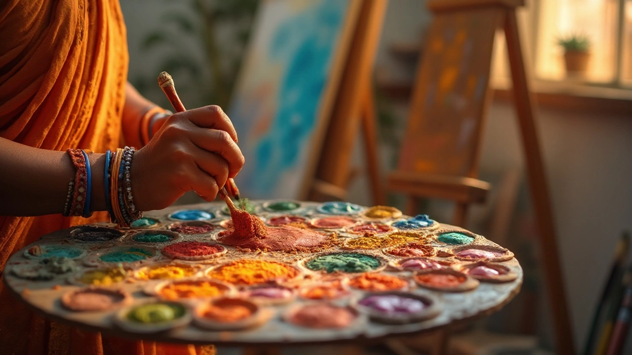
Practical Tips for Picking Your Best Colors
1. Start with a base. Pick one neutral (like warm gray or off‑white) and build around it. Most successful palettes use a 60‑30‑10 rule: 60% base, 30% secondary, 10% accent.
2. Test in your medium. A color that looks great on a screen may shift when mixed with oil or watercolor. Grab a small swatch, dry it, and compare.
3. Use the color wheel. Complementary pairs (blue and orange, purple and yellow) give instant contrast. Analogous groups (blue‑green‑teal) create harmony.
4. Check lighting. Natural light brings out cool tones, while artificial light can warm up a palette. Hang your work near a window and see how it changes.
5. Steal from nature. A sunrise, a forest floor, or a city street at night provides ready‑made combos. Photograph a scene, pull the colors with a picker tool, and you have a unique, organic palette.
When you mix these tips with current trends, you’ll end up with colors that feel fresh but still timeless. For example, combine a rust orange (trend) with a soft sage (nature) and a splash of electric teal (accent). The result is eye‑catching and balanced.
Remember, the best color choice is the one that supports the story you’re telling. If you’re painting a calm landscape, stick to muted greens and blues. For a high‑energy abstract piece, let the neon accents dominate.
Ready to upgrade your palette? Grab a few of the shades mentioned, sketch a quick study, and see how they interact. You’ll quickly notice which combos feel right and which need tweaking. Keep a small notebook of color tests – over time you’ll build a personal library of “best colors” that work for you.
Mix, match, and have fun. The right colors can make your art stand out in any gallery, online feed, or client presentation. Use these tips and you’ll always stay one step ahead of the trends.