Vincent van Gogh Colors: How His Palette Shapes Modern Art and Painting Today
When you think of Vincent van Gogh colors, the intense yellows, swirling blues, and thick, emotional brushstrokes that define his most famous works. Also known as post-impressionist color theory, it’s not just about what he painted—it’s how he made you feel it. Van Gogh didn’t paint what he saw. He painted what he felt. And that’s why his colors still hit hard today—whether you’re a beginner mixing oil paints or a digital artist trying to capture raw emotion in a screen-based piece.
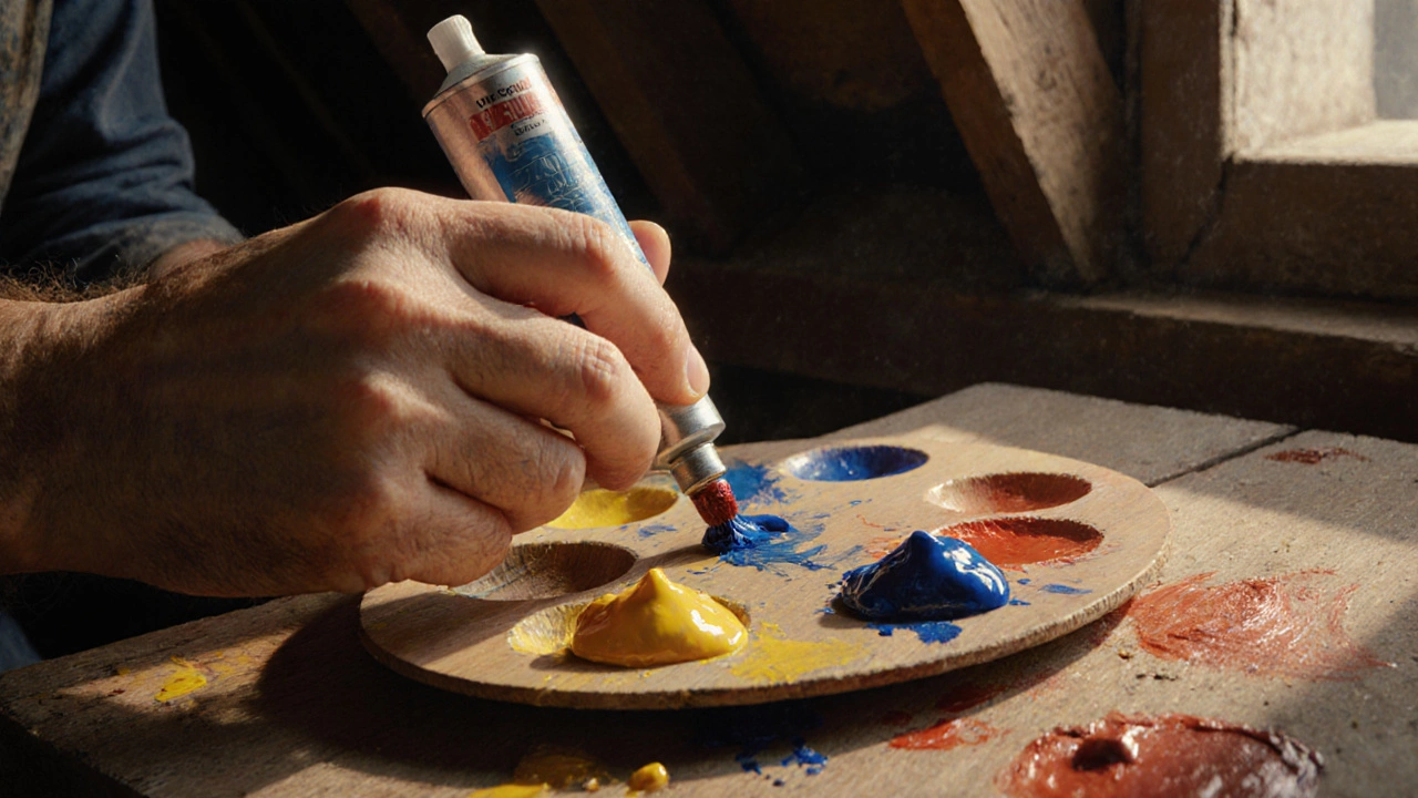
His use of complementary colors, like pairing vibrant yellow with deep blue or orange with purple wasn’t random. It was deliberate. He knew that placing opposites next to each other made each one pop harder. That’s why his sunflowers glow and his night skies vibrate. Modern artists still copy this trick—not because it’s old, but because it works. Even in AI-generated art or digital remixes, if you want something to feel alive, you borrow from van Gogh’s playbook. And it’s not just about the hues. His impasto technique, layering paint thickly so it sticks up off the canvas gave his colors weight, texture, and movement. You don’t just see them—you feel them.
Look at the posts below. You’ll find guides on how to start painting portraits with limited colors, why starting with dark values creates depth, and how to brighten a dull oil painting using glazing. Every one of those tips connects back to what van Gogh mastered: values over details, emotion over perfection, and color as a language. He didn’t need realism to move people. He used color to scream, whisper, and burn. Today’s artists—whether they’re painting on canvas or editing digital layers—are still learning from him. You don’t need to be a master to use his colors. You just need to be willing to feel them.