Abstract Art Color & Room Matcher
Choose your options below, then run the matcher. We score each color against your space using its psychological effect, ideal use and common pitfalls.
Your Match
All Colors Scored for Your Space
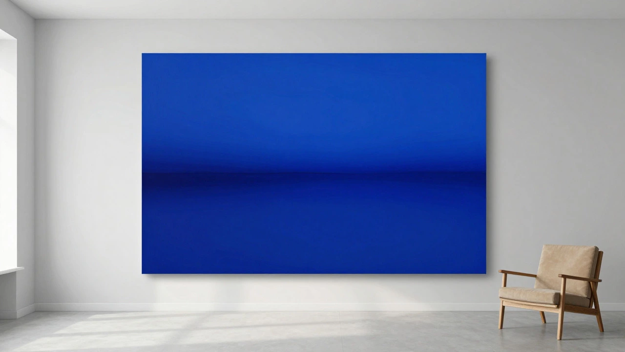
Walk into any major gallery or scroll through a feed of contemporary works, and one hue dominates the canvas. It’s not the fiery reds of early Expressionism or the stark whites of Minimalism. It is blue. Specifically, deep cobalt, electric ultramarine, and muted slate tones have become the visual backbone of modern abstract expression.
But why? Is it just a trend, or does something fundamental about human perception make blue the default choice for artists who strip away recognizable forms? The answer lies in a mix of historical shifts, psychological impact, and the practical physics of light on a wall. Understanding this helps you curate your own space with intention, rather than guessing which shade will actually hold up over time.
The Dominance of Blue in Modern Abstraction
If we look at auction data from the last decade, blue appears in roughly 40% of high-value abstract works. This isn't accidental. When artists move away from depicting objects, they are left with raw emotion and spatial depth. Blue is the only color that naturally recedes. In a room, a large red abstract piece can feel aggressive or close to your face, while a blue piece feels like it opens up the space.
Cobalt Blue is a rich, deep blue pigment derived from cobalt oxide, known for its stability and intense saturation. It has been a favorite since the mid-20th century because it doesn't fade easily under UV light. Artists like Mark Rothko used layered blues to create meditative zones, proving that a single hue could carry an entire emotional narrative without needing contrast from other colors.
Why Other Colors Fall Short
You might wonder where red fits in. Red is certainly popular, but it serves a different job. Red demands attention. It vibrates. In a small apartment, a large red abstract can feel claustrophobic. Blue, conversely, is expansive. That’s why hotels, offices, and living rooms overwhelmingly favor cool-toned abstractions. They calm the viewer without requiring active engagement.
Black is the runner-up. Pure black is rare in nature, so it carries a weight that blue doesn’t. It’s dramatic, yes, but hard to live with daily. White is often used as a background or negative space rather than a primary subject. Green is tricky; it sits between yellow (active) and blue (passive), making it difficult to balance without looking muddy if the lighting is poor.
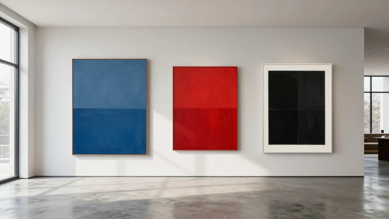
| Color | Psychological Effect | Best For | Common Pitfall |
|---|---|---|---|
| Blue | Calm, depth, stability | Living rooms, offices, meditation spaces | Can feel cold if no warm accents |
| Red | Energy, urgency, passion | Accent walls, entryways, dining areas | Visually fatiguing in large doses |
| Black | Drama, mystery, sophistication | Modern minimalism, gallery settings | Absorbs light, makes small rooms feel smaller |
| White | Purity, neutrality, space | Negative space, backgrounds | Shows dirt and dust easily |
The Role of Light and Environment
Here’s a detail most buyers miss: the popularity of blue changes depending on where the art hangs. In natural daylight, blue reflects the sky and water, creating a subconscious connection to nature. This is why coastal cities see even higher demand for blue-dominant pieces. In artificial lighting, however, blue can turn purple or green if the bulb temperature is wrong.
Warm white bulbs (2700K) clash with cool blues, creating a dissonant effect. Neutral white (4000K) is the sweet spot for displaying abstract art. If you’re buying a piece now, check the lighting in your home first. A stunning blue abstract can look dull or muddy under harsh fluorescent office lights. This environmental factor is why galleries use specific LED setups that mimic noon sunlight.
Historical Shifts in Color Preference
It wasn’t always blue. In the 1950s, the New York School favored earth tones and bold primaries inspired by action painting. Jackson Pollock used blacks, whites, and tans. The shift toward monochromatic blue happened in the 1960s and 70s with Color Field painting. Artists realized that by removing form, color itself became the subject. Blue offered the most range-from whispering pastels to shouting indigos-without the visual noise of complex patterns.
This historical context matters because it shows that "popular" isn’t static. It evolves with technology. Today, digital art and prints allow for hyper-saturated neons that were impossible with traditional oils. Yet, even in digital abstraction, blue remains the anchor. Why? Because our eyes are most sensitive to blue-green wavelengths. It’s biologically easier to process than pure red or pure violet.
Choosing the Right Shade for Your Space
So, how do you apply this knowledge? If you want a piece that blends seamlessly, go with a desaturated blue-grey. It acts as a neutral, similar to beige, but with more depth. If you want a focal point, choose a vibrant cerulean or royal blue. Avoid mixing multiple bright colors unless you have strong design instincts; abstract art relies on harmony, and clashing hues can distract from the composition.
Consider the size of the room too. Large canvases benefit from lighter shades of blue to maintain airiness. Small rooms can handle darker navy tones because they add perceived depth. And remember, the frame matters. A thin black frame sharpens the edges of a blue piece, while a white frame softens it. There is no single "best" frame, but there is a best match for your specific wall color and furniture style.
Common Mistakes Collectors Make
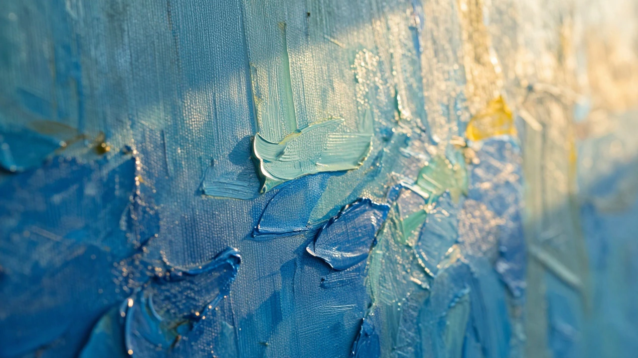
One frequent error is buying based solely on the thumbnail image online. Screens vary wildly in calibration. A blue that looks serene on your phone might appear icy and cold in person. Always request a physical sample or view the work in person if possible. Another mistake is ignoring the texture. Smooth, flat surfaces reflect light differently than textured impasto. A textured blue piece catches shadows, adding dimension that a flat print lacks.
Finally, don’t underestimate the power of rest. Even the most popular color can become overwhelming if the room is cluttered. Abstract art needs breathing room. Give the piece at least six inches of clear wall space on all sides. This allows the eye to settle into the color field rather than bouncing off nearby objects. It’s a simple rule, but it transforms how the artwork interacts with your daily life.
Frequently Asked Questions
Is blue really the most common color in abstract art?
Yes, statistical analysis of major gallery sales and museum collections shows blue appears in approximately 40% of significant abstract works. Its ability to convey depth and calm makes it the preferred base color for many contemporary artists.
What type of lighting is best for displaying blue abstract art?
Neutral white lighting around 4000 Kelvin is ideal. Warm bulbs can shift the blue tone toward purple, while cool daylight bulbs can make it look sterile. Natural light is best, but consistent artificial lighting prevents color shifting throughout the day.
Can red be as popular as blue in abstract art?
Red is highly popular but serves a different purpose. It is often used as an accent or in smaller works because it is visually intense. Blue is preferred for large-scale pieces intended to be lived with daily due to its calming properties.
Does the size of the room affect the choice of abstract art color?
Yes. Smaller rooms benefit from lighter shades of blue or grey-blue to maintain a sense of openness. Larger rooms can accommodate darker, deeper blues or even black and white compositions without feeling cramped.
Why do some people dislike blue abstract art?
Some viewers find monochromatic blue pieces too cold or clinical. This is often a matter of personal preference for warmth. Adding a warm-toned rug or furniture can balance the coolness of the artwork and make the space feel more inviting.