Portrait Composition Simulator
Have you ever looked at a portrait and felt something was just... off? The face might be perfectly painted, the colors vibrant, yet it feels unbalanced or awkward. Often, the culprit isn't your brushwork; it's where you placed the subject on the canvas. This is where the rule of thirds comes in. It’s not just a photography trick; it’s one of the most powerful compositional tools for painters looking to create engaging, dynamic portraits.
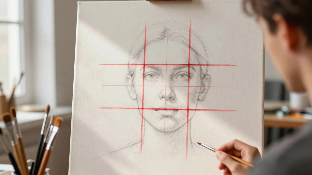
The rule of thirds is simple in theory but profound in practice. Imagine dividing your canvas into nine equal parts using two equally spaced horizontal lines and two vertical lines. The key idea is to place important elements-like eyes, noses, or horizons-along these lines or at their intersections. These intersection points are often called "power points." When you align your subject with these points, you create a natural flow that guides the viewer’s eye through the image, making the portrait feel more alive and intentional.
Why the Center Isn’t Always Best
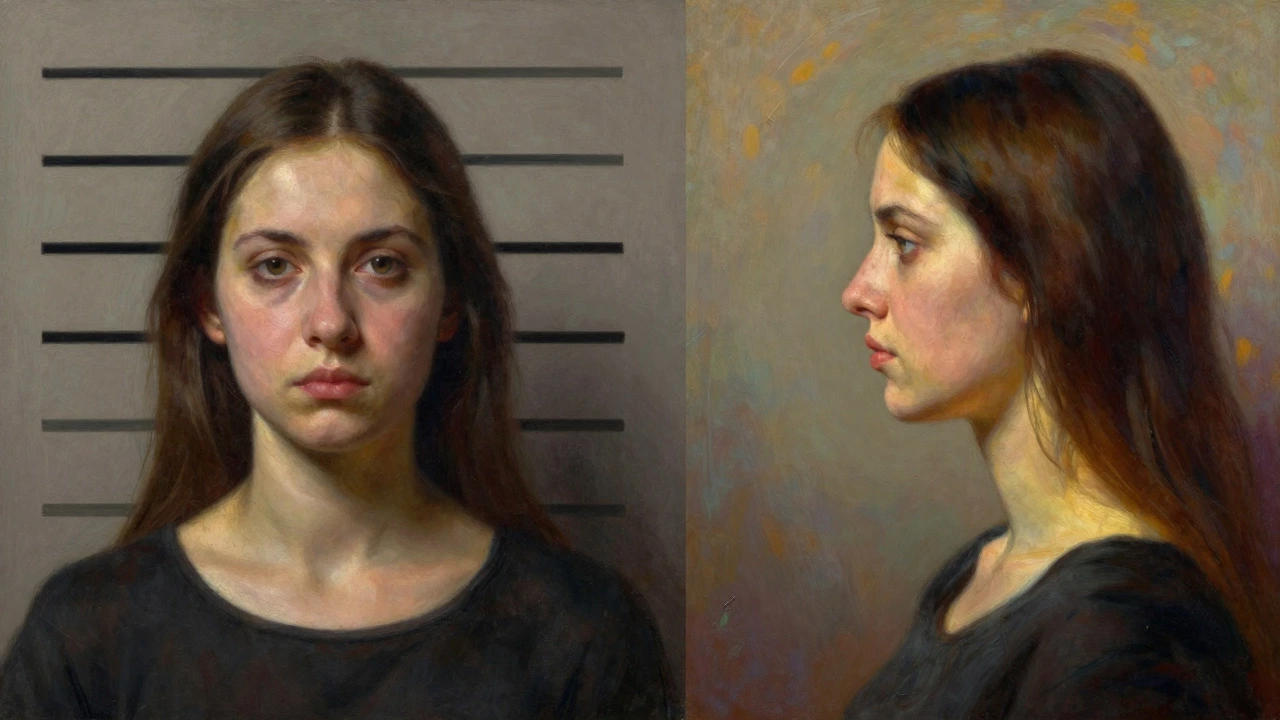
We’re taught early on to center our subjects. It’s safe, symmetrical, and easy. But symmetry can also mean static and boring. In portrait painting, placing the head dead-center can make the image feel like a mugshot rather than an artistic expression. The rule of thirds breaks this monotony by introducing asymmetry. Asymmetry creates tension and interest. It suggests movement, even in a still life. By shifting the face slightly to the left or right third line, you give the subject space to "look into" or interact with the empty space, known as negative space. This negative space becomes just as important as the figure itself, adding depth and context to the narrative of the painting.
Is the rule of thirds only for photography?
No. While popularized by photographers, the rule of thirds applies to any visual medium, including painting, graphic design, and film. It is a fundamental principle of composition based on human perception and balance.
Placing the Eyes: The Golden Intersections
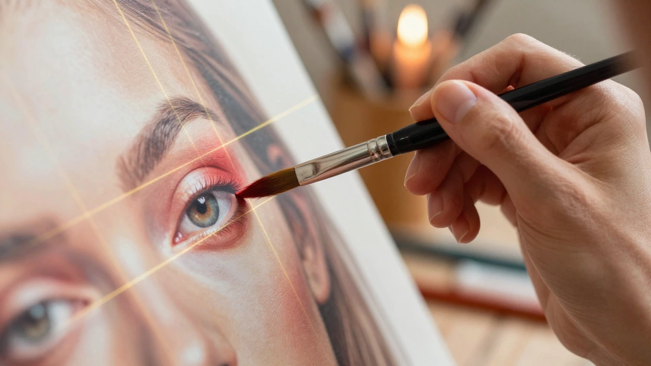
In portrait painting, the eyes are the focal point. They are what viewers connect with first. According to the rule of thirds, you should aim to place the dominant eye (usually the one closer to the viewer) at one of the four intersection points of the grid. If your subject is looking to the left, place their right eye on the upper-left intersection. This alignment feels natural because it mimics how we scan images-from top to bottom, left to right. Placing the eyes on the horizontal third line also helps keep the head from appearing too high or too low in the frame, which can distort proportions.
Think about a classic Renaissance portrait. Notice how the sitter’s gaze often leads you out of the frame or towards another element within the painting. That directional pull is enhanced when the eyes are positioned according to the rule of thirds. It creates a subtle dialogue between the subject and the viewer, inviting us into the story rather than just observing a static image.
Using Lines to Frame the Face
The vertical and horizontal lines of the grid aren't just for dots; they are for edges and contours. You can align the side of the nose, the jawline, or the shoulder with one of the vertical lines. For example, if you want to emphasize the profile of a face, aligning the cheekbone along the right vertical third can add structural integrity to the composition. Similarly, the horizon line in a background landscape should sit on the lower or upper horizontal third, never in the middle. This prevents the background from splitting the portrait awkwardly and ensures the environment supports the subject without competing for attention.
| Mistake | Rule of Thirds Solution |
|---|---|
| Centered head looks flat | Shift head to left or right vertical line |
| Eyes in middle of canvas | Place eyes on upper horizontal line |
| Background splits image evenly | Move horizon to top or bottom third |
| No clear focal point | Align key feature with intersection points |
Breaking the Rules: When to Ignore Them
Like all rules in art, the rule of thirds is a guideline, not a law. There are times when breaking it enhances the impact. Symmetry can be powerful for conveying stability, authority, or serenity. A centered portrait might be perfect for a formal royal portrait or a minimalist study where balance is the primary goal. Additionally, if you’re aiming for a chaotic, energetic, or unsettling mood, deliberately misaligning elements can evoke those emotions. The key is intentionality. Know why you are choosing to break the rule. If you center the subject, do it because you want to convey solidity, not because you forgot the grid exists.
Practical Tips for Painters
How do you apply this while standing at the easel? Here are some practical steps:
- Sketch Lightly: Before applying paint, lightly draw the three-by-three grid on your canvas. Most canvases come with faint guidelines, or you can use a pencil and eraser.
- Use Thumbnails: Create small, quick sketches of different compositions. Try placing the face in each of the nine sections to see which feels most balanced.
- Check Your References: If using a photo reference, overlay a digital grid to analyze where the photographer placed the subject. Learn from their choices.
- Step Back: Periodically step back from your work. Does the eye naturally go to the power points? If not, adjust your initial sketch before committing to paint.
Remember, the rule of thirds is a tool for communication. It helps you control where the viewer looks and how long they stay engaged. By mastering this simple grid, you transform your portraits from mere representations into compelling visual stories. Experiment with it, break it, and find what serves your artistic vision best.