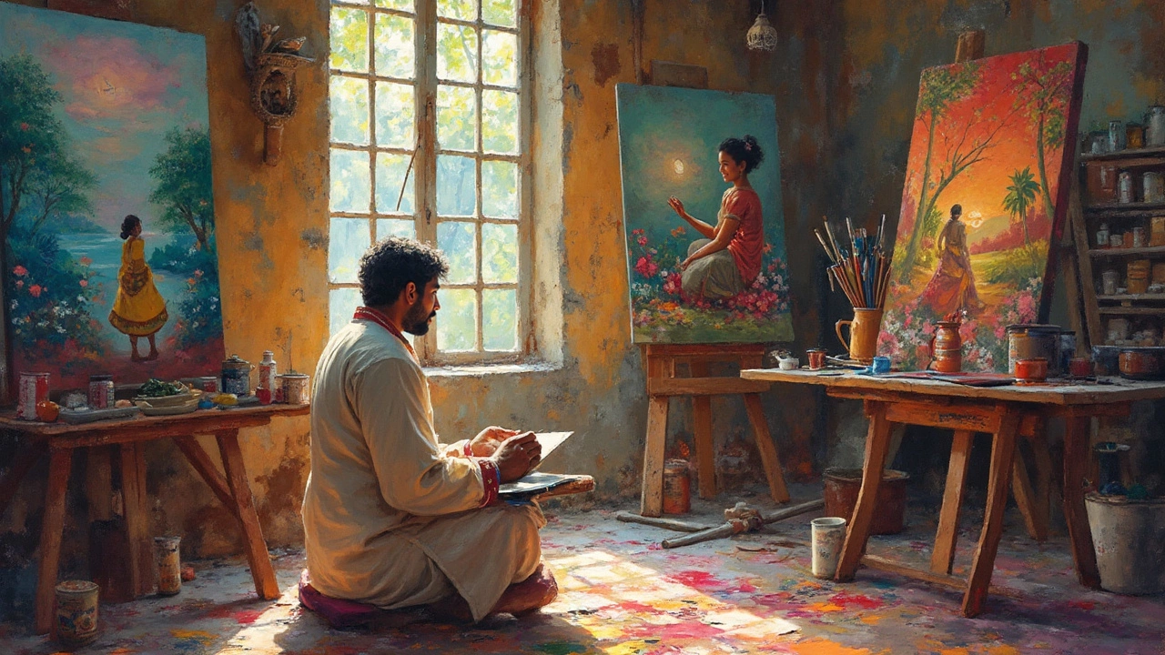
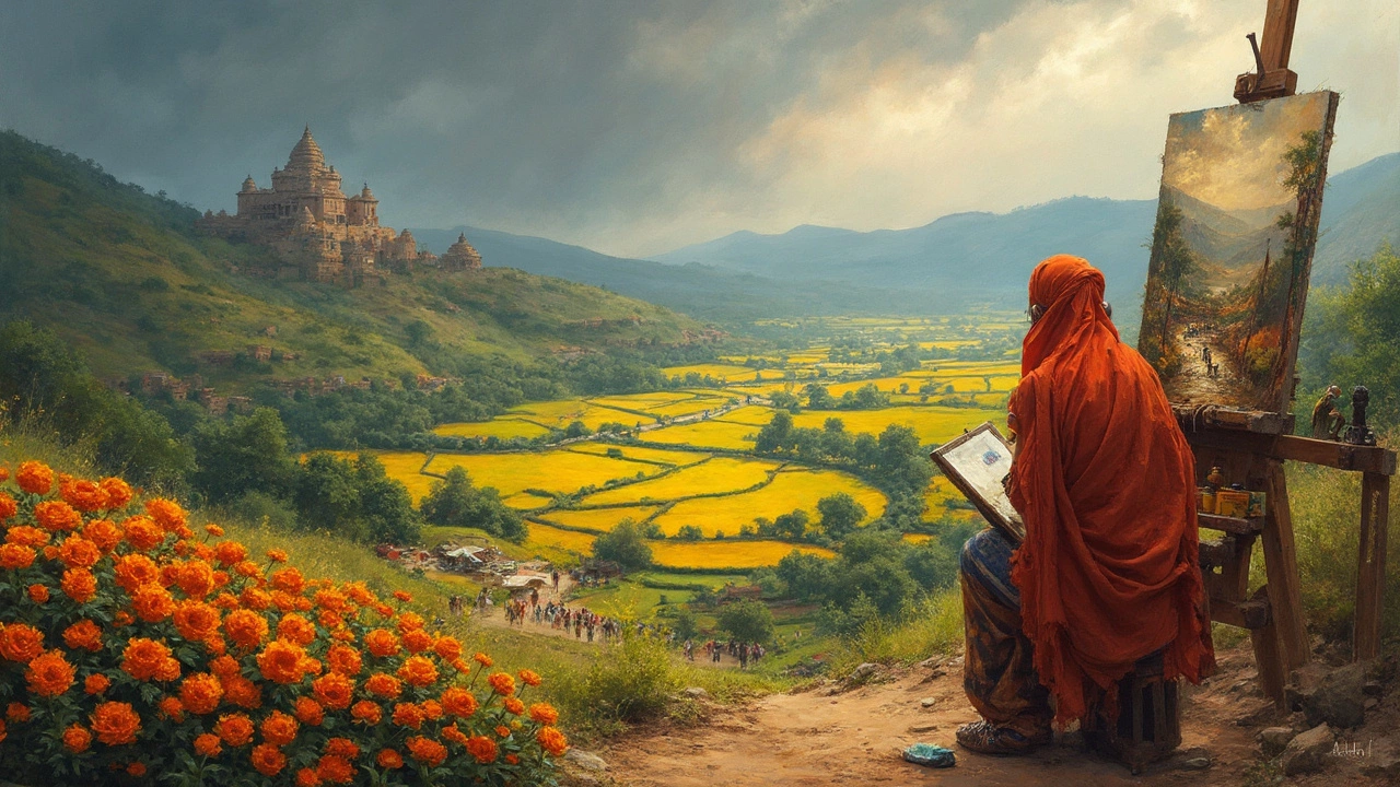
Art Composition: Quick Guide to Strong Visual Storytelling
When you hear “art composition,” think of the invisible skeleton that holds a picture together. It’s not just about where you put a tree or a person; it’s how every part works with the rest to guide the viewer’s eye. Good composition can turn a decent sketch into a memorable piece, while a weak layout can make even the flashiest colors feel lost.
Key Elements of Strong Composition
Balance keeps the piece from feeling heavy on one side. You can use symmetrical balance (mirroring left and right) or asymmetrical balance (different objects that still feel even). For example, a bright orange apple on the left can be balanced by a cluster of cooler blues on the right.
Focal Point is the spot you want viewers to notice first. Place it using contrast, size, or color. A large, saturated shape against muted surroundings instantly draws attention.
Hierarchy tells the eye the order to look at elements. Larger, brighter, or more detailed objects usually come first, followed by secondary items that support the story.
Rhythm creates movement. Repeating shapes, lines, or colors can lead the eye across the canvas, making the composition feel alive.
Space matters just as much as what you fill it with. Negative space, the empty areas, gives the eye a place to rest and can emphasize the main subjects.
Practical Ways to Improve Your Art Composition
Start with a thumbnail sketch. Sketch a few quick layouts on a small scale before committing to the final size. This helps you test balance and focal points without wasting time.
Try the rule of thirds. Imagine a grid of two vertical and two horizontal lines. Position key elements along these lines or at their intersections to add natural interest.
Use a limited color palette for the first pass. Too many colors can muddy the visual hierarchy. Pick one dominant hue, one supporting hue, and a neutral background.
Look at everyday scenes. Notice how street signs, windows, and people naturally form lines and shapes. Replicating those patterns makes your work feel more intuitive.
Get feedback early. Show a friend or post a thumbnail on a platform like Instagram. Quick reactions often reveal if your focal point actually works.
Finally, study the posts on this site that focus on specific media – like “How to Activate Oil Paint” or “What Is Giclée?” – and see how the authors arrange text and images. Their layouts follow the same composition rules you can apply to your art.
Remember, composition isn’t a rigid formula; it’s a toolbox. Mix, match, and experiment until the piece feels right to you. With these basics, you’ll start creating art that grabs attention and holds it longer.