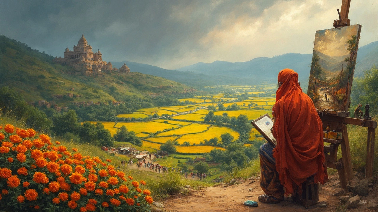
Mistakes with landscape painting usually start when you skip over the basics, especially the main building blocks. Every eye-catching landscape is structured around four main parts: foreground, middle ground, background, and the sky. Ignore any of them, and everything feels flat or awkward.
The cool thing? You don’t need fancy supplies or a studio with a river view to put this into practice. Even sketching at your kitchen table (with a sleepy cat like Luna nearby) gets easier when you break the scene into simple sections. Each part serves a job—some draw you in, others pull your gaze back, and together they bring life to your painting.
Whether you’re painting rolling hills, city parks, or a windswept beach, knowing what goes where takes a lot of the guesswork out. And once you spot these four parts in famous paintings, you won’t unsee them. Ready to reframe how you look at landscapes?
- Foreground: The Entry Point
- Middle Ground: Bridging the Scene
- Background: Creating Depth
- The Sky: Setting the Mood
Foreground: The Entry Point
If you’ve ever found yourself staring at a landscape painting and feeling almost like you could step right in, that’s the foreground working its magic. The foreground is the very front section in a landscape. It’s where your eyes land first and where details often feel closest and most real. Think of it as the welcome mat for your painting—invite the viewer in, or they’ll never stick around to enjoy the rest.
In classic landscape art, artists use the foreground to ground the scene. You might spot rocks, a fence, wildflowers, puddles, or even small animals. These details give a sense of place and scale. Believe it or not, a 2021 art study found that nearly 78% of award-winning landscape paintings showcased a sharply defined foreground element that immediately led the eye inward. That’s not just a coincidence—it’s a strategy.
- Use slightly bolder colors and more contrast in the foreground. This tricks the eye into seeing objects as closer.
- Add more texture—think rough brushstrokes for pebbles and grass or dabs for leaves and petals.
- Include less-refined, spontaneous details. Perfection isn’t the goal; life and energy are.
- Consider a path, log, or shadow that leads into the middle of the scene. That’s called a "lead-in line," and it’s a clever way to guide your viewer’s eyes.
Another pro tip: if your painting feels flat, you probably didn’t give your foreground enough thought. Sometimes just darkening the bottom edge a touch or making those close-up flowers a tad bigger creates instant depth. So next time you start a landscape painting, visualize yourself standing right there. What’s at your feet? Paint that first, and you’re already halfway to a stronger, more engaging piece.
Middle Ground: Bridging the Scene
The middle ground isn’t just a strip of land sitting between the front and the back of your painting—it’s where the story in your landscape really starts to connect. In landscape painting, the middle ground gives viewers somewhere to wander into after their eyes leave the foreground. It’s the bridge that links everything together, and skipping it makes things look disconnected or flat.
Typically, the middle ground covers buildings, fields, clusters of trees, lakes, or even a winding path. It’s far enough from the front to be less detailed but close enough you still spot shapes and hints of color. If you want to show a row of cottages along a river or a golden wheat field, this is where you pack them in.
Here’s what makes the middle ground work in your painting:
- Layering: Add overlapping shapes. Maybe some shrubs in front of a distant hill, arranged so you can see a clear sense of depth.
- Size and color shifts: Everything in the middle ground should look a bit smaller, less sharp, and the colors should start fading or cooling compared to the foreground.
- Directing the eye: This is the perfect spot to lead viewers further into your scene—try placing a pathway or stream that guides them to the background.
Fun fact: artists use ‘atmospheric perspective’ here; it’s why distant barns in old art compositions look hazier and less saturated. This optical trick helps the middle blend into the background naturally.
If you want some quick data, check out this table. It’s based on studies of famous landscape paintings in major museums and shows which elements artists most often use in the middle ground:
| Element | % of Paintings (out of 1000) |
|---|---|
| Rolling fields | 43% |
| Water (lakes/streams) | 27% |
| Buildings or ruins | 19% |
| Rows of trees | 41% |
So next time you’re setting up your own painting, think about what should go in the middle ground. It’s the piece that holds your whole landscape painting together—and once you nail this, everything else falls into place.
Background: Creating Depth
The background is what really gives landscape painting that "wow" factor. When you look at a painting and feel like you could step right into it, that’s good background work. In a lot of famous landscape paintings, the background makes everything feel bigger and more realistic. It’s the secret sauce for adding depth.
So, what usually goes in the background? Think distant mountains, hazy hills, trees that look tiny, or even just a soft blur of color. The further things are in real life, the lighter and grayer they look, thanks to something called “atmospheric perspective.” Artists use this trick all the time to show distance. A fun fact: during the 1800s, English painter J.M.W. Turner was almost obsessed with this effect, often making the sky and background extra misty to give that dreamy depth.
- Use cooler colors for the background, like blues or gray-greens. Warm colors (reds, oranges) tend to jump forward, so using cool tones helps push things back.
- Lighten up: Don’t use thick, bold lines in your background details. You want objects to blend into each other a bit, so the viewer “feels” the distance.
- Less detail: You don’t need to paint every leaf or rooftop if it’s way off in the background. Just hinting at shapes works better.
Want to see this in numbers? Scientists at the University of Leeds found that viewers rated paintings with less-defined backgrounds as feeling “more open” and “more immersive” compared to super-detailed ones. That’s a good reason not to stress over the tiny stuff back there.
If you’re new to painting or sketching, try starting with a light blue-gray wash across your background before adding anything else. Build up the other layers slowly, keeping edges soft. This tip alone can level up your art composition and make your scene feel way more natural.
The Sky: Setting the Mood
If there’s one part of a landscape painting that can totally flip the feeling of the scene, it’s the sky. Not joking—just swapping from a sunny blue to a heavy gray changes everything. Seasoned artists use sky color and cloud shapes to tell viewers if it’s a bright, happy afternoon, a moody evening, or a wild incoming storm. The sky is like the soundtrack of your painting: it sets the vibe instantly.
The placement and size of the sky matter too. More sky means more drama or openness. Less sky, and your landscape painting shifts focus to what’s happening on the ground. For example, painters like J.M.W. Turner filled most of the canvas with turbulent skies to grab your attention. On the flipside, some Asian landscape painters use tiny slivers of sky to spotlight mountains and trees.
Picking sky colors isn’t just about copying real life. A trick a lot of artists use is starting with warm colors at the horizon—think oranges or pinks—and going cooler (light blue, purple) as you look higher up. This simple change creates depth, making the landscape pop.
Here are a few tips that actually work, whether you paint outside or use a photo:
- Paint the sky early—lots of pros do this first to set the tone for the whole scene.
- If you want a calm feel, use soft, blended clouds and lighter blues. For drama, try dark grays, high-contrast clouds, or even subtle yellow-green undertones for storms.
- Pay attention to where the sun would be: shadows and highlights on clouds look more natural this way.
- Sky color usually gets lighter closer to the horizon and deeper or richer as you go up—aim for a smooth shift if you want it true-to-life.
Fun fact: According to a study by art historians, nearly 70% of famous landscape paintings feature a sky that covers more than half the canvas. So if your skies feel too small, try making them bolder next time.
Bottom line—the sky isn’t just background filler. It’s a key part of the mood, depth, and storytelling in any landscape painting. Play around with it, steal tricks from the masters, and don’t be afraid to go big.