Light to Dark: How Contrast Shapes Art, Mood, and Market Value
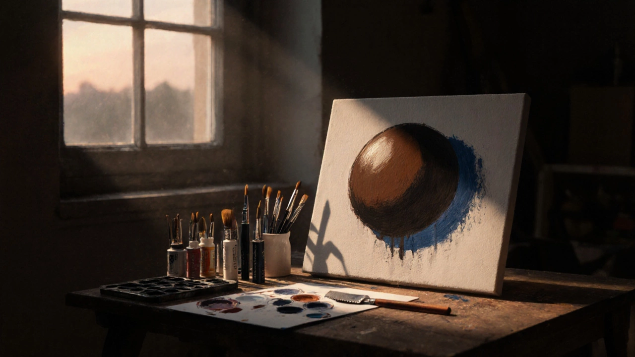
When we talk about light to dark, the deliberate use of value contrast to create depth, emotion, and focus in visual art. Also known as chiaroscuro, it’s not just a technique—it’s the backbone of how art speaks without words. Think of a portrait where the light catches a cheekbone while the rest fades into shadow. That’s not luck. That’s control. Artists use this shift to guide your eye, tell a story, and even make a piece feel more valuable. Galleries know it. Collectors feel it. And the best-selling paintings? They almost always nail this balance.
It’s not just about oil paint. chiaroscuro, a method of using strong contrasts between light and dark to model three-dimensional forms has been used since the Renaissance, but today it’s alive in digital art, remixes, and even photo edits. A digital artist tweaking a portrait in Photoshop? They’re doing the same thing Rembrandt did—with sliders instead of brushes. The value in painting, the relative lightness or darkness of a color, independent of its hue is what makes a flat image feel real. Without it, even the most colorful artwork looks lifeless. That’s why artists who master this don’t just paint—they sculpt with light. And that’s why buyers pay more for pieces where the light feels intentional, not accidental.
Look at the posts below. You’ll see how light to dark shows up in every corner of art creation. From how to brighten a dull oil painting using glazing, to why certain canvas sizes sell better because they frame contrast more effectively, to how portrait painters use value to nail anatomy. Even in digital art pricing, artists who understand value contrast charge more—not because they use fancy tools, but because their work has weight, depth, and presence. This isn’t about being flashy. It’s about being clear. And clarity? That’s what sells.