Portrait Tips: Simple Ways to Boost Your Portrait Skills
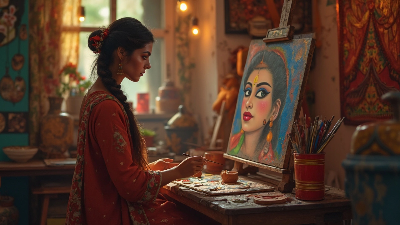
Ever felt stuck trying to capture a real face on canvas? You’re not alone. The good news is that a few straightforward tricks can turn a flat sketch into a portrait that feels alive. Below you’ll find the most useful tips you can try today, no matter if you work in oils, acrylics, or digital media.
Lighting and Composition
First thing: light decides the mood. Place your subject near a window and let natural light hit one side of the face. This side‑lighting creates a gentle shadow that adds depth without being harsh. If you work indoors, a softbox or a diffuser over a lamp works just as well.
Next, think about where the eyes land. The classic “rule of thirds” helps – imagine a grid of nine equal squares and put the eyes on the top line, near a vertical line. This placement draws the viewer’s eye straight to the most expressive part of the portrait.
Don’t forget background. A plain, muted backdrop keeps the focus on the sitter. If you want a bit of context, use subtle elements that echo the subject’s personality – a book, a musical instrument, or a favorite color.
Getting the Face Right
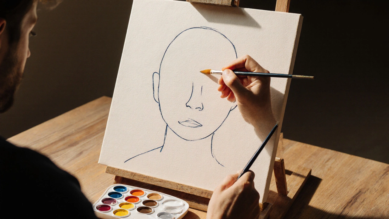
Start with basic shapes. Draw a light oval for the head, then add a vertical line for symmetry and a horizontal line for the eye level. From there, map out the nose, mouth, and ears using simple proportions: eyes are roughly one eye‑width apart, the bottom of the nose sits halfway between the eyes and chin, and the mouth sits a third of the way down from the nose.
When adding details, keep your strokes loose at first. Rough shading helps you see where the light hits before you commit to darker tones. Build up layers gradually – a light wash of skin tone, then subtle shadows, and finally the richer colors for cheeks and hair.
For digital artists, use separate layers for skin, hair, and shadows. This way you can tweak each part without ruining the whole piece. A soft eraser works wonders for blending edges.
Choosing Materials
Whether you prefer oil, acrylic, watercolor, or a tablet, each medium has its own quirks. Oil gives you a long drying time, perfect for blending. Acrylic dries fast, so work in thin layers and keep a spray bottle handy to stay wet. Watercolor rewards quick, confident strokes and works best on toned paper for a richer look.
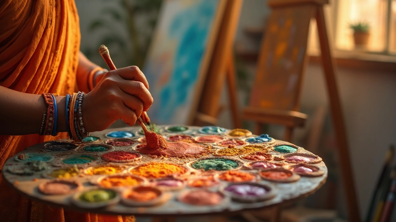
Experiment with a small palette. Too many colors can muddy the skin tones. Stick to a limited set: a warm base (like burnt sienna), a cool complement (ultramarine), a bright highlight (cadmium yellow), and a deep shadow (ivory black mixed with a touch of ultramarine).
Pricing and Commission Tips
Planning to sell your portraits? Start by researching what other artists charge for similar work. Factors that affect price include size, medium, detail level, and whether you’re offering a quick sketch or a fully finished piece.
When a client asks for a portrait, ask clear questions: preferred size, deadline, and any specific elements they want. This helps you give an accurate quote and avoid surprise revisions later.
Consider a tiered pricing system. A small 8x10 pencil sketch might be $80, while a full‑color oil on canvas 18x24 could be $500+. Adding a “rush fee” for tight deadlines is a common practice and lets you manage your time better.
Common Mistakes to Avoid
One big mistake is ignoring anatomy. Even stylized portraits look better when the basic bone structure is correct. Use reference photos or a simple skull model to check proportions.
Another pitfall is over‑detail. Too many fine lines can make a portrait look busy and distract from the face’s expression. Focus on the eyes, mouth, and the way light shapes the cheekbones – those are the real storytellers.
Lastly, don’t shy away from feedback. Show your work to friends or post in a community forum. Constructive criticism helps you spot issues you might have missed and pushes your skill forward.
With these tips in hand, you’re ready to create portraits that capture personality, mood, and a hint of the subject’s story. Grab your tools, set up some good light, and start painting – the best learning happens while you work.