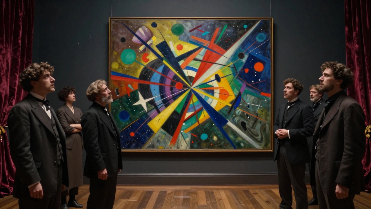
You’re staring at a set of images that feel bigger than a pretty picture. You want the right name-something that fits galleries, statements, even your website menu. Is it fine art photography? Art photography? Conceptual work? The name you choose shapes how curators read your portfolio, how collectors search for your prints, and how your work sits in the art world.
TL;DR: The name and the big picture
Here’s the short answer and how to use it without second‑guessing yourself.
- The accepted term is fine art photography. You’ll also see “art photography” and “photographic art.” All three point to the same idea: images made as art, driven by a concept or expression, not by client briefs or pure documentation.
- Museums often just use “Photography” as the department label; context (exhibitions, statements) signals the art intent.
- If your work centers on a clear idea, personal voice, and intentional presentation (prints, sequence, installation), calling it fine art photography is accurate.
- “Conceptual photography” is a kind of fine art photography focused on ideas first. “Pictorialism” is a historic movement (late 19th-early 20th c.), not a catch‑all synonym.
- Use “photographic prints” (or name the exact process) when labeling works for sale: title, year, process, size, and edition.
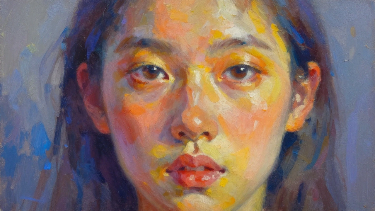
What “fine art photography” actually means
Fine art photography is photography made as art. The target isn’t a news page, a brand brief, or family archive-it’s a body of work that communicates a concept, mood, or point of view. Intent matters, but so does how the work is executed and presented: editing, sequencing, printing, scale, framing, and where it’s shown.
Three anchors keep this definition grounded:
- Intent: You’re making art, not fulfilling a functional brief. The idea leads, not the commission.
- Authorship: There’s a distinct voice. Viewers can sense who is behind the work, not just what’s in front of the lens.
- Presentation: The work is shaped for an art context-cohesive series, prints/installations, and an artist statement that frames the reading.
Authoritative sources back this framing. The Oxford English Dictionary roots “fine art” in work created primarily for its aesthetic or intellectual value. Tate’s art terms explain fine art as distinct from applied or commercial ends. Major museums-MoMA and the Art Gallery of New South Wales-house “Photography” collections curated and exhibited as art, reinforcing that the art context is often signaled by how the work is presented and discussed.
Key distinction: fine art vs. subject matter. A landscape can be fine art if it’s part of a conceptual series and presented as such; the same scene can be editorial if it’s produced to illustrate a travel guide. It’s not the tree or the mountain that makes it art-it’s the concept, the choices, and the context.
How to sanity‑check your own work quickly:
- Write a one‑sentence idea statement: “This series explores [theme] through [formal approach] to ask [question].” If you can’t write it, the intent may be undercooked.
- Lay out 12 images as a sequence. Remove any that don’t serve the idea. Does the series hold together without filler?
- Define the presentation: print process, paper, size, framing, edition. If that feels like an afterthought, clarify your vision before you name it.
Names you’ll see (and when to use each)
Different circles prefer different labels. Use the one that fits the room you’re in-grant applications, gallery proposals, online stores, or school critiques. Here’s how the common terms line up.
| Term | What it signals | Who tends to use it | Good phrasing for labels/bios |
|---|---|---|---|
| Fine art photography | Art‑first intent and presentation | Galleries, artists, collectors | “Fine art photographer focusing on coastal ecologies.” |
| Art photography | Same meaning, slightly broader parlance | Press, blogs, general audience | “Art photography series on suburban myth‑making.” |
| Photographic art | Emphasis on final artwork (prints, installations) | Online shops, interior design, collectors | “Original photographic art, hand‑printed in editions of 10.” |
| Conceptual photography | Idea‑driven work; concept leads the method | Academia, curators, juried shows | “Conceptual photography exploring memory and coastal erosion.” |
| Pictorialism | Historic movement; painterly look, c. 1885-1920 | Historians, museums, collectors of early prints | “Gelatin silver print in the tradition of Pictorialism.” |
| Contemporary photography | Current practice, post‑1970s forward | Curators, museums, academic programs | “Contemporary photography addressing urban sprawl.” |
| Photo‑based art | Work using photographic media among others | Interdisciplinary spaces, MFA programs | “Photo‑based installation with archival pigment prints.” |
Quick notes to avoid confusion:
- Use “fine art photography” or “art photography” for general clarity. They’re the terms most people search and recognize.
- Say “conceptual photography” when your project’s core is the idea, not just the style.
- “Pictorialism” is not a synonym for fine art-it’s a specific, historic style. If your work looks painterly, that doesn’t automatically make it Pictorialist.
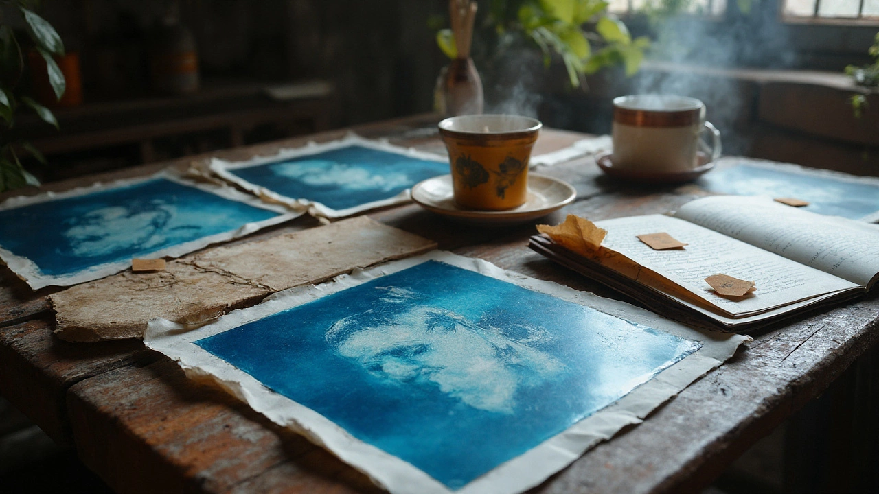
- For sales pages, specify the object: “archival pigment print on cotton rag,” “gelatin silver print,” “cyanotype,” “photogram,” or “inkjet print.” Collectors buy clarity.
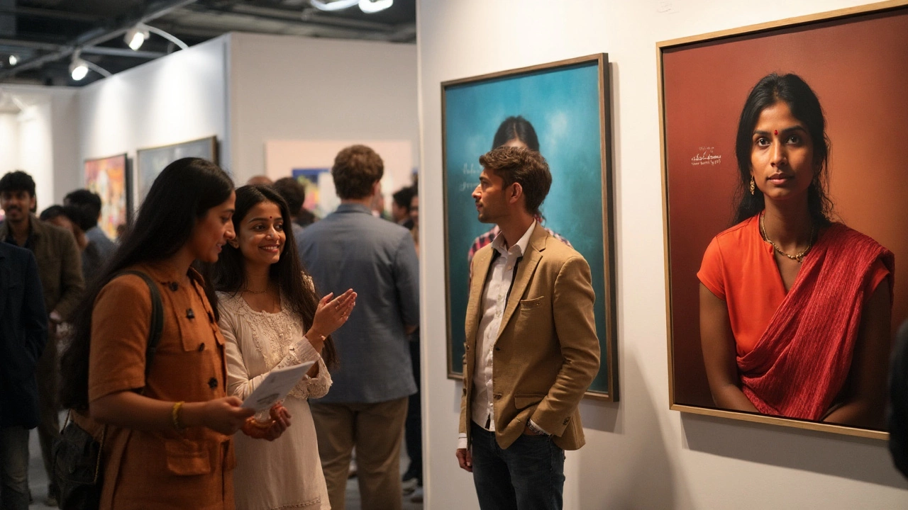
Anecdote from the floor: when I hung a small show in Sydney’s inner west, the gallery listed the work as “Photography” on the wall cards and “Fine Art Photography” on the web page to help searchers find it. Two names, same work-used smartly for two contexts.
Does your work count? A practical checklist
If you’re on the fence, this is the quickest way to check if the label fits your project right now.
- Concept: Can you describe the idea in one or two plain sentences without leaning on gear talk?
- Cohesion: Do 8-20 images work together with consistent visual logic and intent?
- Authorship: Is there a recognizable voice across the series-through composition, color, pacing, or approach?
- Context: Do you plan to present the work in an art setting (gallery, photobook, editioned prints, installation)?
- Craft: Are exposure, editing, and printing serving the idea? If the technique shouts over the message, it’s not ready.
Try this decision path:
- If a client brief dictated the content and delivery, it’s commercial/editorial first. You can still make an art series from the same theme later, but separate the contexts.
- If your primary goal is to inform or record an event neutrally, it leans documentary. Documentary can be shown as art, but the ethics and claims are different. Be clear in your statement.
- If your goal is to explore an idea and present it as artwork, you’re in fine art territory. Use that label and support it with thoughtful presentation.
Examples make it real:
- Urban flora at night: A set of moody close‑ups for a gardening blog? Not fine art. The same images sequenced to examine how cities reclaim plant life, printed big on matte cotton rag with a short text? That’s a fine art series.
- Family beach trip: A cheerful album? Personal documentary. A pared‑back series about absence, shot only at low tide, titled “The Hour the Sea Forgot” and shown as 40×50 cm prints? Fine art.
- Waves at Bondi: Stock photos? Commercial. A long‑term body of work tracking tides and human rituals at dawn, with interviews and a book dummy? Fine art with documentary threads.
Common pitfalls:
- Labeling too early: A handful of pretty images isn’t a series yet. Give it an edit pass and a statement.
- Process as concept: Cyanotype is a process, not a concept. Why cyanotype for this idea?
- Genre confusion: Calling a moody portrait “pictorialist” without historic grounding. If you mean painterly, say painterly.
- Edition inflation: Printing “1/250” to sound in demand. Smaller editions feel considered and collectible.
Rule of thumb I use: if my daughter Eira can tell me what the work is “about” after seeing ten prints on the kitchen table, the concept is probably readable enough to carry the fine art label into public.
Labeling, editioning, and presenting without cringe
Once you’ve settled on fine art photography as the name, the next risk is muddy labels. Clear, consistent metadata helps curators, buyers, and your future self.
How to label a print (wall card or online):
- Title, Year: River Mouth, 2025
- Artist: Your Name
- Medium: Archival pigment print on 100% cotton rag (or Gelatin silver print; Cyanotype; Photogravure)
- Dimensions: Image 30 × 40 cm; paper 40 × 50 cm
- Edition: Edition of 10 + 2 AP (Artist’s Proofs)
- Price: Optional on wall; essential online
Editioning basics (widely accepted practice in Australia, Europe, and the US):
- Pick an edition size before sales (common: 5-15 for large work, 15-30 for smaller).
- Edition by size or medium. If you print the same image in two sizes, treat each size as a separate edition and state it.
- Number each print as you release it: 1/10, 2/10, etc., and keep a simple ledger. APs are outside the numbered edition and usually capped at 2.
- Sign on the verso (back) in pencil with title, year, and edition number; or on a margin if that’s your studio norm. Consistency matters more than fashion.
- Include a certificate of authenticity (COA) with the edition number, paper, inks/process, and your signature.
Print quality choices that read “art” not “office”:
- Paper: 100% cotton rag or baryta papers for depth and longevity. Resin‑coated photo paper can look slick for commercial use, less so for exhibitions.
- Ink/process: Archival pigment for color; gelatin silver for darkroom B&W; alternative processes (cyanotype, platinum/palladium) when they serve the concept.
- Mounting/framing: Acid‑free mounts, UV‑protective glazing if the work will hang in bright spaces. Simpler frames often let the work breathe.
- Scale: Bigger isn’t automatically better. Match size to viewing distance and idea-intimate work can live small.
Naming across platforms (to keep search and curators happy):
- Portfolio site menu: Photography → Fine Art → (Series Title)
- Bio: “Artist working in fine art photography,” or “Artist using photography to explore …”
- Store page SEO: “Fine art photography prints - archival pigment prints - editioned work”
- Grant/CV: Use the term the funder uses. If they write “art photography,” mirror that phrasing in your answers.
Mini‑FAQ
- Is “art photography” less formal than “fine art photography”? Slightly, yes. “Fine art photography” is more standard in galleries; “art photography” is friendlier in general writing.
- Can documentary be fine art? Yes. If you present documentary work with an artistic intent and context, it can function as fine art. Be clear about what’s staged or changed.
- Do I need a gallery to call it fine art? No. The work’s intent and presentation define the category. Galleries validate, they don’t create the category.
- Do I need editions? If you want to sell into the art market, editioning is standard. For books or open prints aimed at decor buyers, you can skip editions but say so.
- What about AI images? Some artists use AI as a tool in “photo‑based” practice. If photography is central to the process and the concept is clear, describe the process precisely to maintain trust.
Next steps for different paths:
- Student or beginner: Pick one idea. Make 20 images. Edit down to 10. Write a 100‑word statement. Print small work prints and pin them up. Adjust what the series needs, not what the best single image does.
- Emerging artist in Australia: Check recent photography shows at the Art Gallery of NSW and the Museum of Contemporary Art Australia to see how wall labels and materials are described. Align your wording and materials to that standard.
- Hobbyist testing the waters: Choose one series to finish as an edition of 10. Print two sizes; edition each size separately. Put the work online with full labels and see how people respond before you print large.
- Applying to a curated show: Use the venue’s vocabulary. If they say “contemporary photography,” use that, and clarify your process in the materials list.
Troubleshooting the naming call:
- If people keep asking “What is this about?” tighten the concept and the edit before you worry about the label.
- If your shop page gets decor buyers but not collectors, move “fine art photography” to the top of the page and add edition details and process names.
- If a curator suggests “photo‑based” instead of “photography,” it may be because your work mixes media. That’s a compliment-embrace the nuance.
Credibility checks you can run today:
- Read Tate’s entries for “fine art” and “photography” for language that aligns with curatorial practice.
- Scan MoMA’s Photography collection descriptions to see how they frame contemporary work.
- Look at Art Gallery of New South Wales’ wall labels online for medium and edition phrasing.
- Flip through an Oxford English Dictionary entry for “fine art” to anchor your statement language in longstanding definitions.
Naming your work doesn’t cage it; it guides it. Use “fine art photography” when your images carry a concept, a voice, and a presentation that treats them as artworks. Switch to “conceptual photography” if the idea is the driver and the images serve that idea. On a sales page, focus on what the buyer gets-an editioned photographic print, with a clear process and thoughtful materials. When I’m hanging prints in Sydney, that mix of clarity and honesty is what brings the right viewers into the room.