Portrait Painting Diagnosis Tool
What's the main issue?
Select the description that best matches your current struggle.
Select an issue to begin
Choose a problem from the left menu to receive specific actionable tips based on professional painting principles.
Key Technique
--
Actionable Steps:
- --
Ever stare at a portrait you’ve painted and feel like it’s just... sitting there? It looks accurate. The eyes are in the right place. The nose matches the reference photo. But something is missing. It feels flat, static, or worse, boring. You’re not alone. Most painters hit this wall when they focus too much on copying what they see instead of interpreting what they feel.
Making a portrait painting more interesting isn’t about adding random details or making the subject look like a caricature. It’s about injecting life into the canvas through deliberate choices in light, color, composition, and texture. When you shift your mindset from "recording" to "expressing," your work transforms. Let’s break down exactly how to do that without losing accuracy.
Stop Copying Photos; Start Interpreting Light
The biggest mistake beginners make is treating a photograph as a perfect map. Photos flatten three-dimensional reality into two dimensions, often with harsh, unflattering lighting. If you copy a photo exactly, you inherit its limitations. To make your painting pop, you need to understand the quality of light hitting the face.
Ask yourself: Where is the light source? Is it soft and diffused, like on an overcast day, or hard and directional, like midday sun? Soft light creates gentle transitions between shadows and highlights, giving the skin a smooth, glowing appearance. Hard light creates sharp contrasts, deep shadows, and bright highlights, which can add drama and intensity. Don’t be afraid to exaggerate these contrasts slightly. Push the lights lighter and the darks darker than you see in the reference. This technique, known as value stretching, adds visual energy and depth that a flat copy lacks.
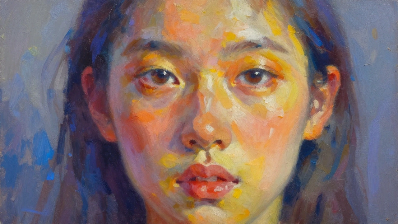
Consider the temperature of the light too. Sunlight is warm (yellow/orange), while shadow areas often reflect cool tones (blue/purple). Even indoor lighting has a cast-tungsten bulbs are warm, fluorescent lights are cool. By consciously choosing warmer colors for lit areas and cooler colors for shadows, you create a vibrant, dynamic range that keeps the viewer’s eye moving across the canvas.
Color Harmony Over Exact Matching
If you mix paint to match the exact hex code of your subject’s skin tone, your portrait will likely look muddy and dull. Real skin is complex, containing hints of red, yellow, green, blue, and purple depending on the lighting and underlying blood flow. Instead of matching one single color, think in terms of color harmony.
Use a limited palette to keep your colors unified. A classic setup might include Titanium White, Cadmium Yellow, Alizarin Crimson, and Ultramarine Blue. With just these four pigments plus black, you can mix almost any skin tone. The key is to vary the saturation. Lit areas should be more saturated and intense, while shadow areas should be less saturated and more grayed out. This variation prevents the painting from looking plastic or airbrushed.
Don’t forget the background. A neutral gray background can make the portrait stand out, but a complementary color background can create a stunning contrast. For example, if your subject has warm, peachy skin tones, try a cool, muted teal or slate blue background. The opposing colors will vibrate against each other, making the face appear to glow forward off the canvas.
| Area | Temperature | Effect |
|---|---|---|
| Lit Skin | Warm (Yellows, Oranges) | Advances visually, feels alive |
| Shadow Skin | Cool (Blues, Purples) | Recedes visually, adds depth |
| Background | Complementary to Skin | Creates contrast and focus |
| Hair/Clothing | Varied | Balances overall composition |
Composition: Guide the Viewer’s Eye
A well-composed portrait tells the viewer where to look first. If you center the head perfectly in the middle of the canvas, the image can feel static and formal. Try shifting the subject slightly off-center using the rule of thirds. Place the eyes along the top horizontal line and one of the vertical lines. This creates a more dynamic and engaging balance.
Use leading lines to direct attention. The curve of the neck, the fold of clothing, or even the direction of the gaze can act as arrows pointing toward the eyes-the most important part of any portrait. Ensure that nothing in the background competes with the face for attention. Simplify busy backgrounds by blurring them or reducing their detail level. Your goal is to make the face the clear focal point.
Consider cropping creatively. A tight crop around the eyes and mouth can create intimacy and intensity. A wider shot that includes shoulders and some environment can tell a story about the person’s context. Think about what you want to convey. Are you capturing a fleeting emotion, or documenting a character? Your framing choice sets the tone before the viewer even processes the colors.
Texture and Brushwork: Show, Don’t Tell
Smooth, blended paint can look professional, but it can also look sterile. Adding variety in brushwork brings personality to your portrait. Use thick, impasto strokes for highlights on the nose bridge, cheekbones, and forehead. These raised areas catch real light, adding physical dimension to the painting. Conversely, use thinner, smoother washes for shadow areas and softer parts like the lips or eyelids.
Don’t be afraid to leave visible brushstrokes. They remind the viewer that a human hand created this work. In areas like hair, loose, energetic strokes suggest movement and volume better than trying to paint every individual strand. Focus on the masses of light and dark within the hair rather than the fine details. This approach, called alla prima, keeps the painting fresh and spontaneous.
Vary your tools. A stiff bristle brush can create rough textures for stubble or fabric, while a soft sable brush is perfect for delicate transitions around the eyes. Using different brushes intentionally adds rhythm to the surface of the painting, preventing it from looking uniform and monotonous.
Capture Expression, Not Just Features
A technically perfect portrait with a blank stare is still boring. The soul of a portrait lies in the expression. Look beyond the shape of the eyes and mouth. Notice the tension in the jaw, the slight furrow in the brow, or the relaxation of the shoulders. These subtle cues reveal the subject’s mood and personality.
Pay close attention to the eyes. The iris should have depth, with darker edges and a lighter center. Add a small, sharp highlight to simulate reflection-it’s crucial for making the eyes look alive. The whites of the eyes (sclera) are rarely pure white; they often pick up the ambient color of the room or the warmth of the skin. Avoid painting them stark white, which can make the subject look dead or shocked.
Encourage your subject to move, talk, or laugh during sittings if possible. Static poses often result in stiff expressions. If working from photos, choose images where the subject seems candid or engaged. Even a slight smile or a thoughtful glance can transform a flat image into a compelling narrative.
Editing: Know When to Stop
One of the hardest skills to learn is knowing when to put the brush down. Overworking a painting kills its energy. Every time you touch a dry area, you risk muddying the colors and losing the initial freshness. Step back frequently to assess the big shapes and values. Does the painting read clearly from five feet away? If yes, resist the urge to fix tiny imperfections that only you can see up close.
Keep a mental checklist: Are the values correct? Is the focal point clear? Is the color harmonious? If these elements are strong, the portrait will succeed even if minor details are loose. Trust your instincts. Sometimes, leaving things slightly unfinished invites the viewer’s imagination to fill in the gaps, creating a deeper connection with the artwork.
Why does my portrait painting look flat?
Flatness usually comes from insufficient value contrast. If your lights aren’t light enough and your darks aren’t dark enough, the form won’t emerge. Stretch your values by pushing the highlights brighter and the shadows darker than you perceive them. Also, ensure you’re modeling the form with gradual transitions rather than abrupt jumps in color.
How do I choose the right background for a portrait?
Choose a background that complements the subject’s skin tone and clothing. A contrasting temperature works best-warm skin against a cool background, or vice versa. Keep the background simple and low in detail so it doesn’t distract from the face. The background should support the subject, not compete with it.
What is the best way to paint realistic eyes?
Focus on the contrast between the iris and the sclera. Paint the iris with rich, varied colors, not just brown or blue. Add a distinct highlight to simulate light reflection. Remember that the whites of the eyes are rarely pure white; mix in subtle grays or warm tones to integrate them with the surrounding skin.
Should I blend my portrait painting smoothly?
Not necessarily. While smooth blending can look polished, visible brushstrokes add energy and texture. Use smooth blending for soft areas like cheeks and lips, but retain looser, textured strokes for hair, clothing, and highlights. Variety in application keeps the painting visually interesting.
How can I improve my portrait composition?
Avoid centering the subject perfectly. Use the rule of thirds to place the eyes off-center. Create leading lines with the body or clothing to guide the viewer’s eye to the face. Simplify the background to eliminate distractions. Cropping tightly can increase intimacy, while wider shots provide context.