Landscape Design Composition Studio
Experiment with the physics of visual perception. Draw lines, place forms, and adjust colors to see how they guide the eye.
You stare at a blank canvas or an empty garden plot. You know what you want it to feel like-peaceful, dramatic, alive-but the result looks flat. Why? It’s rarely because your brushstrokes are wrong or your plants are unhealthy. It’s usually because the underlying structure is missing. Whether you’re mixing oils for a landscape painting or arranging stones in a backyard, you are working with the same five fundamental tools. These aren’t just decorative tips; they are the physics of visual perception.
Most beginners focus on the subject-the tree, the mountain, the flower bed. But professionals focus on the relationships between shapes, light, and space. If you get these five elements right, the subject matter almost takes care of itself. Let’s break down the five basic elements of landscape design that every artist and designer needs to master, not as abstract theory, but as practical levers you can pull today.
Line: The Skeleton of Your Composition
Line is the most basic element, yet it’s often the one we ignore. In landscape design, lines guide the viewer’s eye. They tell the brain where to look first, second, and third. Without intentional lines, a scene feels chaotic or static.
Think about a straight line. It feels rigid, modern, and direct. Now think about a curved line. It feels organic, soft, and flowing. When you paint a horizon, that horizontal line creates calm. If you tilt it slightly, you introduce tension. In garden design, a winding path (a curve) invites exploration, while a straight walkway demands a destination.
- Horizontal Lines: Create stability and rest. Use them for horizons, water surfaces, or long fences.
- Vertical Lines: Add height and drama. Trees, columns, and tall grasses draw the eye upward.
- Diagonal Lines: Inject movement and energy. They suggest action, making a static scene feel dynamic.
A common mistake in amateur landscape paintings is using too many competing diagonal lines. They fight for attention. Pick one dominant direction. If your main focal point is a vertical tree trunk, let the surrounding shrubs follow horizontal or gentle curves to support it, not clash with it.
Form: Giving Weight to the Visuals
If line is the skeleton, form is the body. Form refers to the three-dimensional shape of objects. In real life, trees and rocks have volume. On a 2D canvas, you have to fake this volume using light and shadow. This is where many artists struggle-they draw outlines but forget mass.
There are two types of forms you need to distinguish: geometric and natural. Geometric forms are regular and man-made-squares, circles, triangles. Natural forms are irregular and organic-clouds, leaves, riverbanks. Good design balances these. A perfectly square patio (geometric) looks harsh next to a wildflower meadow (natural) unless you bridge them with something transitional, like a rectangular planter box filled with spilling vines.
To test your understanding of form, squint at your reference photo or your garden. Does the tree look like a solid cone, or does it look like a flat cutout? If it’s flat, you haven’t defined its form. You need to show how light hits the top and sides versus the bottom. In digital terms, this is depth mapping. In artistic terms, it’s modeling.
Texture: The Tactile Experience
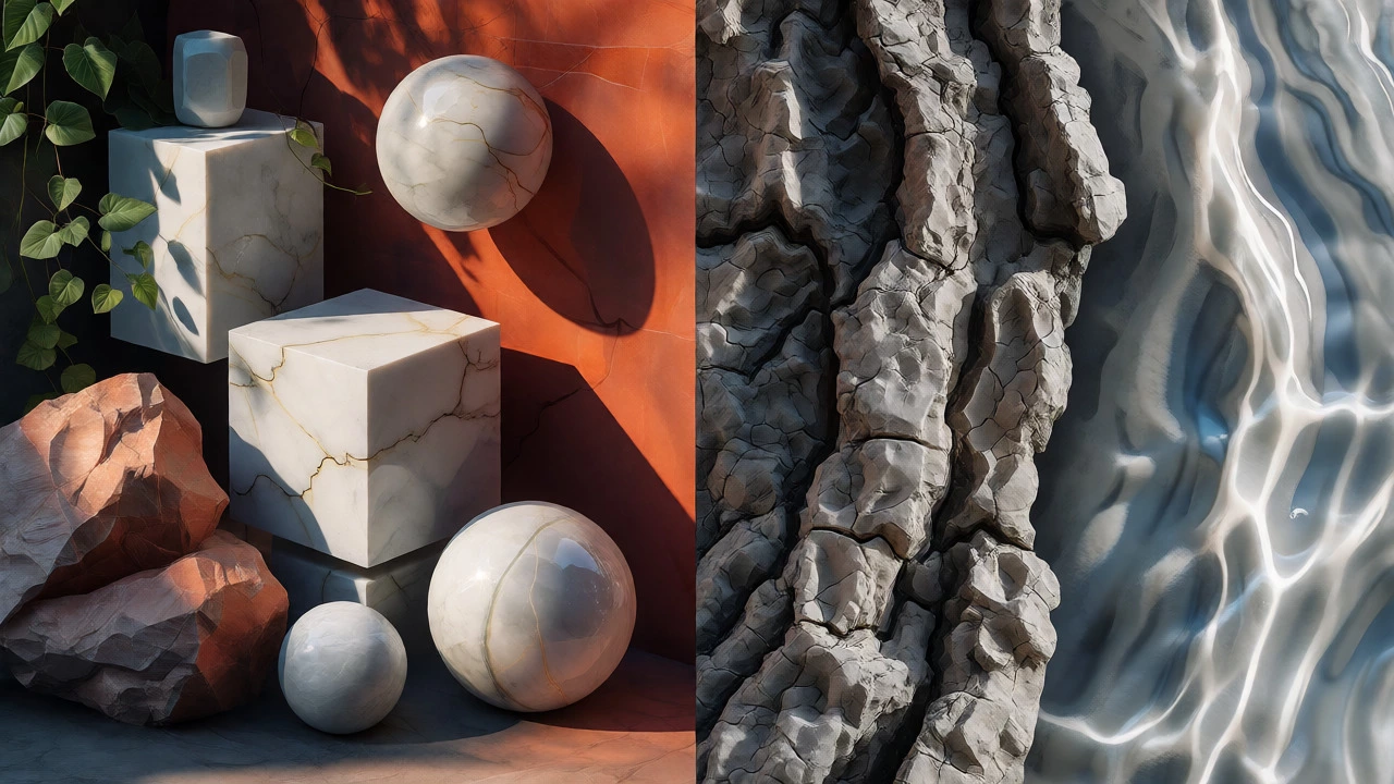
Texture is what makes you want to reach out and touch the image. It’s the surface quality of materials. There’s actual texture (what you feel) and visual texture (what you see). In painting, you create visual texture through brushwork. Thick impasto strokes suggest rough bark; smooth glazes suggest still water.
Why does this matter? Because contrast in texture prevents boredom. Imagine a garden made entirely of smooth pebbles and polished concrete. It might be clean, but it’s visually dead. Now add rough mulch, feathery ornamental grasses, and jagged slate rocks. Suddenly, there’s interest. The eye moves from smooth to rough, creating rhythm.
| Texture Type | Visual Effect | Best Used For |
|---|---|---|
| Smooth | Calm, reflective, modern | Water features, glass, polished stone |
| Rough | Dramatic, grounding, rustic | Bark, rock walls, gravel paths |
| Fine | Delicate, airy, detailed | Moss, ferns, fine sand |
| Coarse | Heavy, bold, structural | Large boulders, broad-leafed plants |
In Sydney, where I live, we see this constantly. The rough, weathered sandstone cliffs contrast beautifully with the smooth, shimmering surface of the harbor. That juxtaposition is what makes the view iconic. Don’t be afraid to mix textures. Just ensure there’s a clear hierarchy-one dominant texture, supported by others.
Color: The Emotional Driver
Color isn’t just decoration; it’s temperature, distance, and mood. Most people think color choice is subjective. It’s not. It’s scientific. Warm colors (reds, oranges, yellows) advance toward the viewer. Cool colors (blues, greens, purples) recede into the background.
This is crucial for creating depth in a landscape painting. If you paint a distant mountain in bright red, it will pop forward and ruin the illusion of distance. Paint it in muted blue-grey, and it pushes back. This principle, known as atmospheric perspective, is non-negotiable for realistic scenes.
But beyond depth, color sets emotion. A monochromatic scheme (shades of one color) feels unified and serene. A complementary scheme (opposites on the color wheel, like blue and orange) feels vibrant and energetic. A triadic scheme (three evenly spaced colors) feels balanced and lively.
Here’s a pro tip: Limit your palette. Beginners often use every tube of paint they own. Professionals use three main colors plus white and black. Why? Because too many hues create noise. If you’re designing a garden, stick to two dominant colors and use foliage green as the neutral base. It keeps the space feeling cohesive rather than cluttered.
Scale and Proportion: The Hidden Metric
Scale refers to the size of an object relative to another object. Proportion refers to the relationship between parts of a whole. This is where human psychology kicks in. We judge everything based on our own body size.
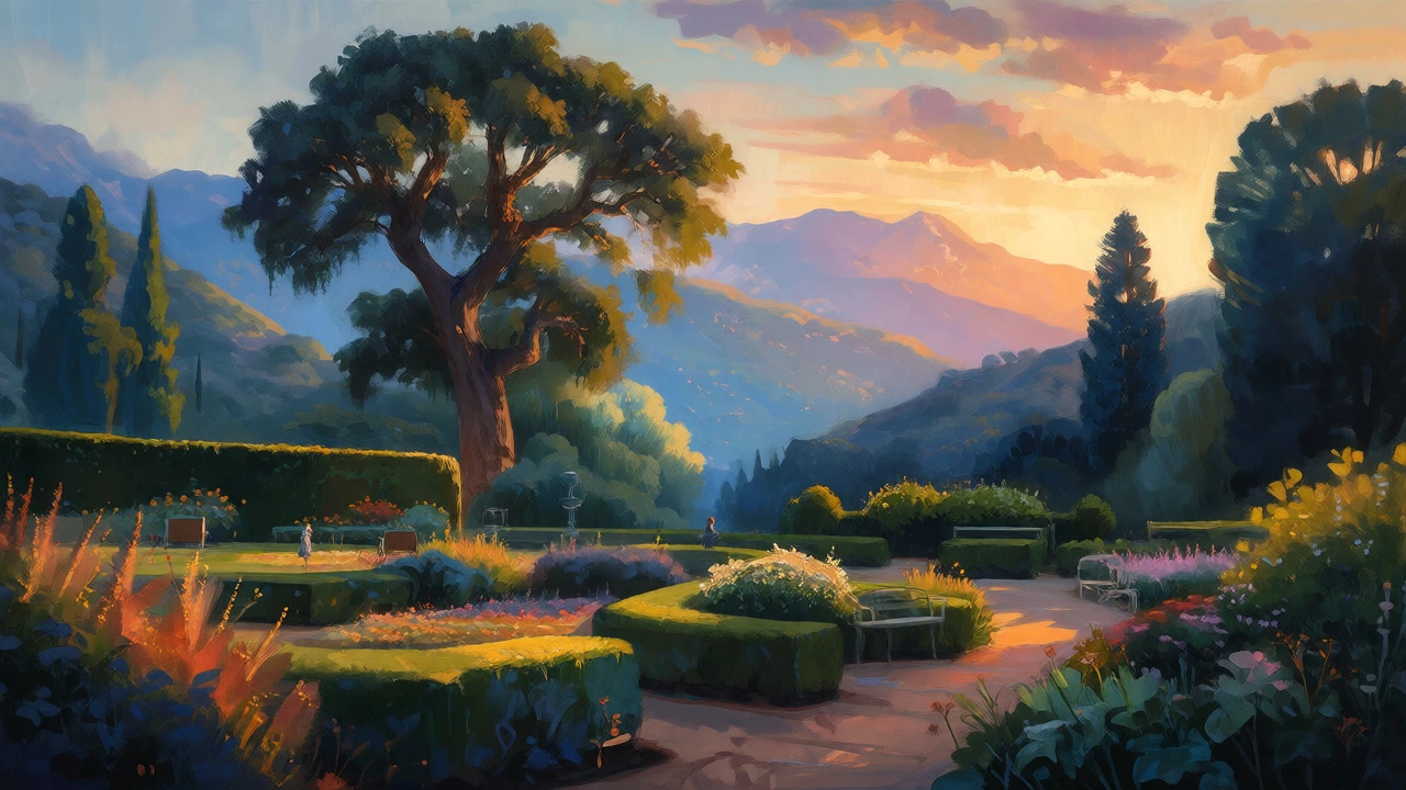
A massive oak tree next to a small cottage creates a sense of awe. A tiny potted plant next to a skyscraper feels insignificant. In design, you control this narrative. Do you want your garden to feel intimate? Use smaller plants and lower hedges. Do you want it to feel grand? Use large trees and expansive lawns.
The golden ratio (1:1.618) often appears in nature and pleasing designs. While you don’t need to measure every inch, keeping proportions in mind helps. For example, if you place a bench in a garden, it should be proportional to the surrounding seating area. Too big, and it dominates; too small, and it looks lost.
| Concept | Definition | Design Application |
|---|---|---|
| Human Scale | Objects sized relative to the average person | Path widths (1m), fence heights (1.5m) |
| Monumental Scale | Objects significantly larger than humans | Large trees, wide plazas, towering statues |
| Intimate Scale | Objects smaller than human scale | Garden beds, low walls, cozy nooks |
When painting, check your scale. Is the person in the foreground too large compared to the house behind them? If so, your perspective is off. Consistency here builds trust with the viewer.
Bringing It All Together
These five elements-line, form, texture, color, and scale-don’t work in isolation. They interact. Color affects perceived scale (warm colors look closer/larger). Texture influences line visibility (rough textures break up lines). Form defines how light hits color.
The best landscapes feel inevitable. Like they couldn’t have been any other way. That’s because the artist or designer mastered the interplay of these basics. They didn’t just throw pretty things together. They constructed a visual argument.
Start simple. Take a photograph of your favorite park or a classic landscape painting. Identify the dominant line. What shape is the main tree? What textures are present? How does color guide your eye? Once you start seeing these elements, you’ll never look at a scene the same way again. And your own creations-whether on canvas or in soil-will gain a new level of sophistication.
Do these elements apply to digital landscape art?
Absolutely. Digital tools change the medium, not the principles. Line tools define edges, layer modes help with color blending, and brushes simulate texture. The logic of guiding the eye with line and creating depth with cool/warm colors remains identical whether you use oil paints or Photoshop.
How do I choose the right color palette for a landscape?
Start with the time of day and season. Morning light is cool and soft; sunset is warm and high-contrast. Choose a base hue (like green for summer) and limit your accents to one or two complementary colors. Avoid using more than three primary hues to maintain unity.
What is the difference between line and contour?
Line is the edge or boundary of a shape. Contour specifically refers to the line that defines the three-dimensional form of an object. In landscape design, lines can be implied (like a row of trees) without being physical edges, whereas contours always describe the surface topology of a specific object.
Can I break these rules?
Yes, but only after you understand them. Abstract expressionists break rules of form and color intentionally to evoke emotion. However, breaking rules randomly leads to chaos. Break them with purpose-for example, using a jarring diagonal line to create discomfort in a dystopian landscape scene.
How does texture affect the perception of distance?
High-detail, high-contrast textures appear closer. Low-detail, blurred textures appear farther away. This is why distant mountains in paintings are often rendered with smooth gradients and minimal detail, while foreground rocks are painted with sharp, distinct strokes.