Portrait Success Calculator
Enter your portrait's key elements to receive tailored advice for enhancing expression, lighting, and composition.
Have you ever looked at a portrait and felt like you were staring into the soul of the person depicted? It’s not just about accuracy. A perfect likeness can still feel flat if it lacks life. On the other hand, a slightly stylized face can jump off the canvas and demand your attention. So, what separates a good sketch from a truly successful portrait painting? It comes down to a mix of technical skill, emotional connection, and smart compositional choices.
The Power of Expression Over Accuracy
Many beginners think that a successful portrait means every pore and eyelash must be perfectly rendered. But art history tells us otherwise. Think about Vincent van Gogh’s self-portraits. They are not photorealistic. Yet, they communicate intense emotion, anxiety, and hope. The goal is not to copy a photograph but to interpret a human being.
Expression starts with the eyes. The eyes are often called the windows to the soul for a reason. If you get the light reflection in the iris right, the subject feels alive. You don’t need to paint every detail of the eyebrow, but you do need to capture the direction of the gaze. Is the subject looking at you? Are they lost in thought? Looking away?
- Direct gaze: Creates intimacy and confrontation. The viewer feels seen.
- Averted gaze: Suggests introspection, shyness, or storytelling beyond the frame.
- Closed eyes: Implies peace, sleep, or deep internal focus.
Beyond the eyes, look at the mouth and the tension in the jaw. A tight lip says something different than a relaxed smile. Even a neutral expression has micro-tensions. Capturing these subtle shifts makes the portrait feel real rather than static.
Lighting as a Storytelling Tool
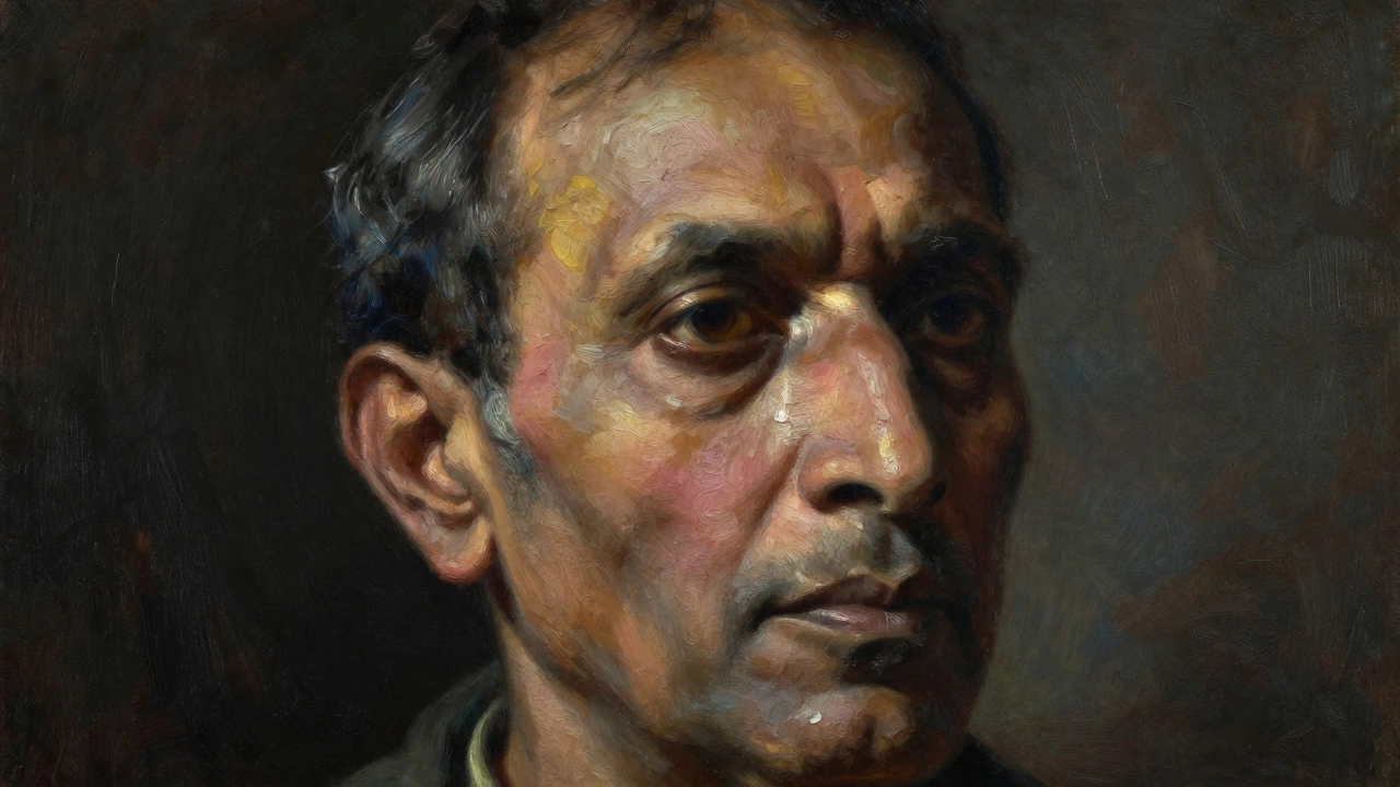
Light is not just illumination; it is structure. In a successful portrait painting, light defines the form and sets the mood. Without careful attention to light and shadow, a face looks two-dimensional. You need to understand where the light source is coming from and how it interacts with the bone structure.
Consider the classic Chiaroscuro technique used by Caravaggio. He used extreme contrasts between light and dark to create drama. You don’t need such extremes, but you do need contrast. The highlights on the forehead, nose, and cheekbones should pop against the shadows under the chin and eye sockets.
| Style | Description | Emotional Impact |
|---|---|---|
| Rembrandt Lighting | Triangle of light on the shadowed cheek | Dramatic, classic, mysterious |
| Butterfly Lighting | Small shadow under the nose, symmetrical | Flattering, glamorous, soft |
| Split Lighting | Half face lit, half face in shadow | Tense, dual-natured, bold |
| Rim Lighting | Light outlines the edges of the head | Separares subject from background, ethereal |
Pay attention to the color of your shadows too. Shadows are rarely just black or gray. They often reflect the ambient colors of the room. A blue sky might cast cool blue shadows, while a warm lamp adds orange tones. Using colored shadows adds depth and realism that pure black cannot achieve.
Composition and Framing Choices
How you frame the subject changes how the viewer perceives them. A tight close-up forces the viewer to confront the details of the skin and expression. A wider shot includes the shoulders and environment, giving context to who this person is.
Don’t center everything. While centered portraits can work for formal ID-style images, they often feel static in fine art. Try placing the subject slightly off-center using the rule of thirds. Leave more space in the direction the subject is looking. This gives their gaze "room" to travel, which feels more natural to the eye.
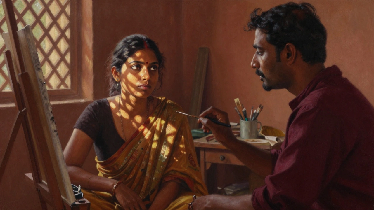
Also, consider the background. A busy background competes with the face. Unless the background tells part of the story (like a painter in a studio), keep it simple. Muted tones or blurred textures help push the subject forward. The relationship between the subject and the background creates visual hierarchy.
Color Harmony and Skin Tones
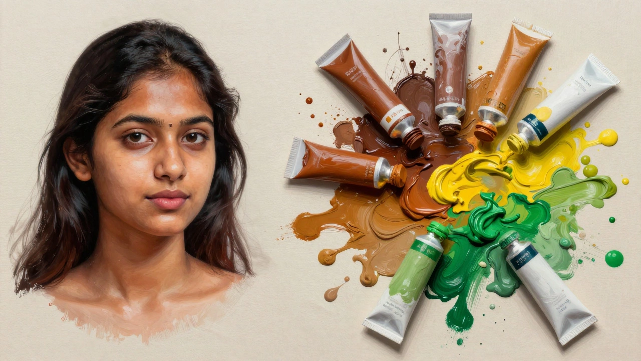
Painting skin is notoriously difficult because it involves so many subtle variations. We tend to think of skin as one color, but it’s actually a complex mix of pinks, yellows, blues, and greens. A successful portrait painting uses a limited palette to maintain harmony.
If you use too many bright, saturated colors on the face, it can look garish. Instead, try mixing your flesh tones with earthy pigments like burnt sienna, raw umber, and yellow ochre. Add touches of complementary colors to make the skin glow. For example, a hint of green in the shadows of a warm-toned face can make the highlights appear brighter without adding white.
Consistency is key. Ensure that the lighting temperature matches across the entire canvas. If the light is warm, the shadows should be cooler, and vice versa. Mixing cold and warm lights randomly confuses the brain and breaks the illusion of three-dimensionality.
Texture and Brushwork Personality
Your brushstrokes tell the viewer how you feel about the subject. Thick, impasto strokes can convey energy and movement. Thin, glazed layers suggest delicacy and calm. A successful portrait doesn’t have to be smooth everywhere. Sometimes, leaving visible brushwork adds character.
Think about the texture of the materials you are painting. Hair, fabric, and skin all have different textures. You can mimic the softness of skin with blended edges and the roughness of a wool coat with dry, scratchy strokes. Varying your technique keeps the painting interesting to look at up close.
However, avoid overworking areas. Once a passage is correct, step back. Constantly going over the same spot muddies the colors and kills the freshness of the paint. Trust your initial instincts. Freshness often reads as confidence to the viewer.
Connecting with the Subject
Finally, the most intangible element of a successful portrait is the connection between the artist and the sitter. If you are painting from life, talk to your subject. Ask them questions. Make them laugh. These moments reveal the true personality behind the mask people wear in public.
If you are working from photos, study the image until you know the person’s habits. How do they hold their hands? What is their posture? These small details add authenticity. A portrait is not just a map of a face; it is a biography in paint.
Ultimately, a successful portrait painting balances technical precision with emotional resonance. It invites the viewer to pause, look closer, and wonder about the life of the person staring back. Whether you are a beginner or an experienced painter, focusing on expression, light, and genuine connection will elevate your work beyond mere representation.
Do I need to be good at drawing to paint a successful portrait?
Strong drawing skills help with proportion and placement, but they are not the only factor. Many successful painters use loose sketches or even projectors to handle the basic structure. What matters more is your ability to observe values, colors, and expressions. You can learn to adjust proportions during the painting process if you focus on relationships rather than isolated lines.
What is the best medium for portrait painting?
There is no single "best" medium. Oil paint allows for slow blending and rich glazes, making it great for realistic skin tones. Acrylic dries quickly, which is good for building layers fast but harder to blend smoothly. Watercolor offers transparency and spontaneity but requires precise control. Choose the medium that matches your workflow and the mood you want to achieve.
How do I fix a portrait that looks "dead"?
A "dead" portrait usually lacks contrast or life in the eyes. First, check your value range. Are your darks dark enough and your lights light enough? Increase the contrast to give the face structure. Second, add a sharp highlight to the cornea of the eyes. Finally, look for subtle color variations in the skin. Adding warm reds to cheeks or cool purples to shadows can bring vitality back to the painting.
Should I paint portraits from photos or from life?
Both methods have merits. Painting from life teaches you to see true colors and dynamic expressions, as the subject moves and reacts. However, it is time-consuming and expensive. Photos provide a stable reference and allow you to study details at your own pace. The best approach is often a combination: use photos for study and preliminary work, but seek live sittings to refine your observational skills.
How important is the background in a portrait?
The background supports the subject. If it is too detailed or colorful, it distracts from the face. A successful portrait usually has a simplified background that complements the skin tones. Use analogous colors or low-contrast patterns to keep the focus on the subject. The background can also set the mood, such as using dark tones for drama or bright whites for airiness.